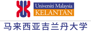
徽标与理念

Universiti Malaysia Kelantan’s (UMK) logo emphasizes on the letter "U", "M" and "K". The design symbolizes the elements and nature of the university’s openness and timelessness. From another perspective, the hourglass shape reflects life-long learning which has no limit of time in the process of learning. This idea links to the image of two hands asking for God's blessing and solace (redha) while being eternally grateful
The image of the chromosome represents the active and dynamic nature of interaction in the University's environment.The selection of the color "blue" is for Malaysia, "red" for Kelantan and "orange" for ripe areca which refers to heritage
This logo is supported by UMK’s philosophy which focuses on six (6) aspects, namely :
马来西亚吉兰丹大学(UMK)的标志强调字母“U”,“M”和“K”。该设计象征着大学的开放性和永恒性的元素和性质。从另一个角度看,沙漏形也体现了终身学习,学习过程没有时间的限制。这个想法与双手祈求上帝的祝福和安慰(redha)的形象联系在一起,同时永远感激
染色体的形象代表了大学环境中相互作用的活跃和动态的性质。颜色的选择“蓝色”代表马来西亚,“红色”代表吉兰丹,“橙子”代表成熟的槟榔,代表遗产
这个标志是由UMK的理念支持的,该理念侧重于六个方面,即:
Entrepreneurial Education创业教育
Third language第三语言
ICT as an enabler.ICT是一个推动者。
Lifelong learning.终身学习。
Quality human capital.优质人力资本。
Uniqueness and relevancy.唯一性和相关性。


